A Space for Quiet Contemplation and Art- The New Kinder Building of the MFAH
Nancy and Richard Kinder modern and contemporary arts building
It was the year 1924. In a world where fascism was slowly creeping across Europe, and former colonies were slowly gaining independence, the Art League in the growing city of Houston opened the museum building of Houston Art League to the public. The patrons of that original opening couldn’t possibly have imagined that their museum would become the second largest art museum in America, and the largest one in the South, in the span of a century.
The Museum of Fine Arts, Houston, has grown from the building designed by local architect William Ward Watkin, to a world-class institution of three buildings, collectively displaying over 64000 artworks from 6 continents. Driving down Montrose, one would be forgiven to think that the immense buildings of the Fine Arts Museum each belonged to different institutions, because they all look very different from each other. This is by design. Each building of the Museum of Fine Arts reflects a trend in architecture that existed over the past 100 years, creating an interesting contrast and transporting a patron from the Greco-Roman facade of a neoclassical building to the sleek glass exterior of a modernist building in a matter of seconds.

The newest addition to this incredible family of buildings is the Nancy and Richard Kinder modern and contemporary arts building, designed by Steven Holl Architects, who also designed the nearby Glassell School of Art (also owned by the MFAH). The expansive project, built over the span of five years, spared no expense, doubling the MFAH’s exhibition space while also adding to the museum’s Cullen Sculpture Garden. Therefore, any analysis of the project must begin outside, in the serene sculpture garden, where the changes can be taken in.

The tour starts outside the Law building, at the intersection of Montrose and Bissonnet. From here, one can get a good view of all three MFAH buildings, and the sculpture garden. The most noticeable change here is the triumphant return of the Crab, an immense red steel sculpture by Alexander Calder, the abstract artist most famous for his mobiles, one of which can be found in the Audrey Jones Beck building across the street. The Crab, which had not been on display for at least five years, is a stabile, , as it cannot move. Seeing this sculpture, one is reminded of science fiction novels, where huge, alien machines with long legs terrorize the world and decimate the population. The idea that something that could scare people in such movies is displayed publicly as art is humurous, and the fact that the sculpture is painted a bright, orangey-red just adds to the hilarity. Very few other sculptures are displayed outside near the Law building, and they are all on the other side, facing the picturesque limestone facade of the original Watkin structure.

It is from the entrance of the Law building that we cross the street, and enter into the sculpture garden, an area so green it feels like a completely different world, with only hints of civilization. The garden designed by Isamu Noguchi is serene, to say the least. Noguchi was possibly the greatest landscape architect of the last 50 years, and had an incredibly successful career spanning six decades, designing structures like the Peace Garden at the UNESCO headquarters in Paris, and becoming the first Asian-American artist to be represented in the White House collection, when a sculpture by him was installed on the grounds in 2020. It is only natural that this garden is a masterpiece of outdoor architecture and an icon of Houston’s devotion to public art. Sculptures pop-out from everywhere, inhabiting areas of varying elevation. There are concrete slabs dividing the garden, creating paths the patrons can traverse and acting as walls for outdoor gallery spaces. Some sculptures are even mounted directly on the wall, closing the gap between sculpture and 2 dimensional artwork.
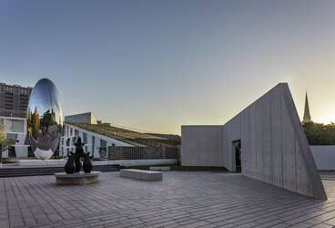
Once one has had enough time at the main sculpture garden, they can take in the change and return to civilization by going to one of the many pools of the newly built Kinder building. These pools are an extension of the sculpture garden, and this can be discerned, as the first one a patron encounters is La Rivière by Aristide Maillol, an artist who was already represented in the main sculpture garden. This bronze sculpture is absolutely beautiful, occupying a raised platform above a rectangular pool, which itself is raised, so the viewer can see the water running down the sides. It creates an interesting contrast between the allegorical figure from the 19th century and the dark, simplistic pedestal of the modern period.
From here, one only needs to take a few steps to find the next pool, which displays Byung Hoon Choi’s site specific work, Scholar’s Way. This work is a set of three dark, column-like masses created by the artist as part of a series of site-specific works the MFAH commissioned to christen its new building.

The sculptural fountains occupy specific focal points in the building’s design, and the parts of the building that look at these fountains have huge glass windows, allowing for an incredible amount of natural light to flow in. Another benefit of these huge windows is that they allow patrons to see inside the galleries from the outside, without having to wait in line or risk their health trying to get in.
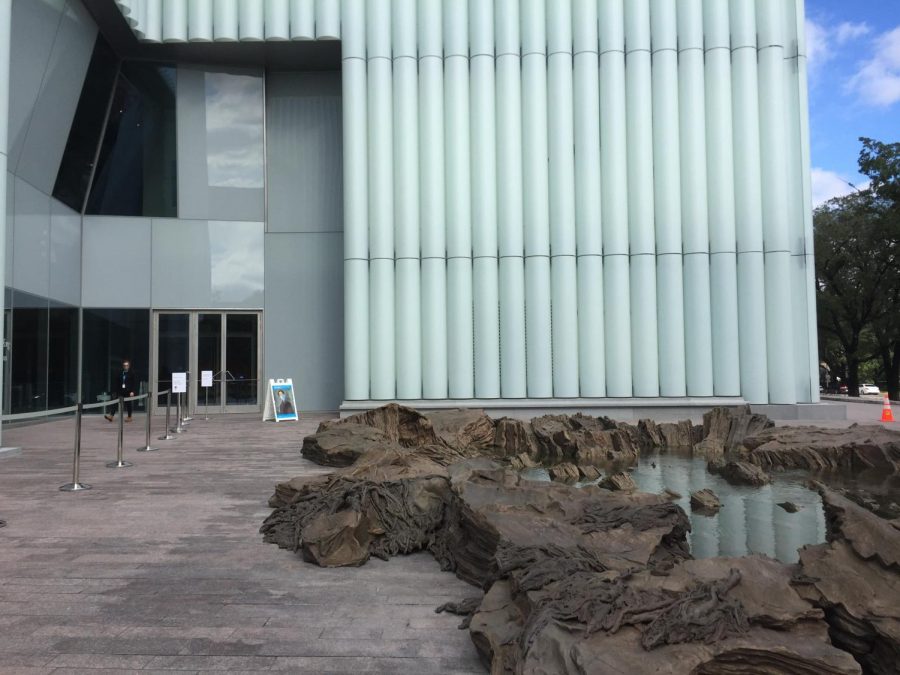
Taking a few steps, we reach the main entrance, which looks at a massive sculpture by Spanish artist Cristina Iglesias, titled Inner Landscape. This work is cast bronze, and is just breathtaking with its detail. It appears as if a rainforest has suddenly appeared before the museum, with tangled tree roots, small puddles of water, and sharp rocks all leading to a pool. One can feel so many different textures, yet everything is made out of the same material and has the same tint. Everything is still, yet moving, as if an entire ecosystem was petrified, and survived perfectly preserved into the modern day, frozen in time.
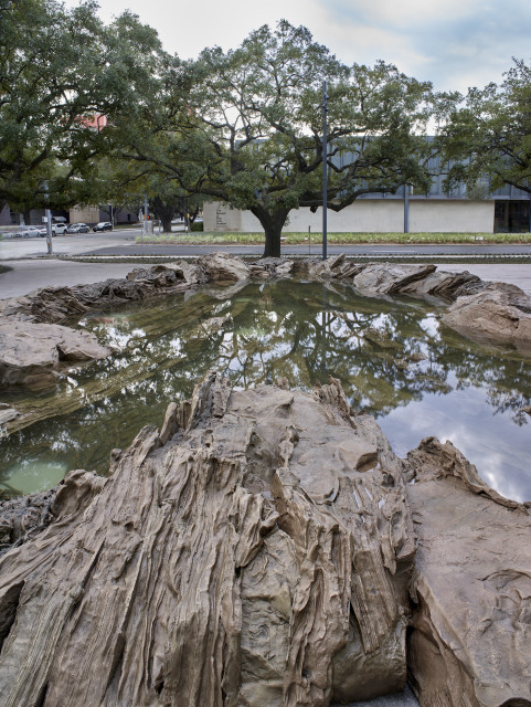
The pool also reflects the beautiful Texas sky, which is something the architect of the Kinder building, Steven Holl, intended to do as well. The design of this building differs sharply from Holl’s Glassell School, which uses geometric shapes to create a structure that resembles an Escher print. The Kinder building uses curvilinear and organic shapes that act as canopies and allow the flow of natural light, and also reflect the shapes of the clouds above the building, making it look as if the building was being molded by the clouds. But the structure does not only reach for the sky. In fact, much of the building is underground, making the building bigger than it actually looks to be from street level. There are two tunnels connecting this building to the others, each with a site specific work that uses light and color. There is also a massive underground parking garage occupying the space under the Glassell school and sculpture garden, making the MFAH campus as complex underground as it is above ground, a marvel of engineering and architecture on both levels.


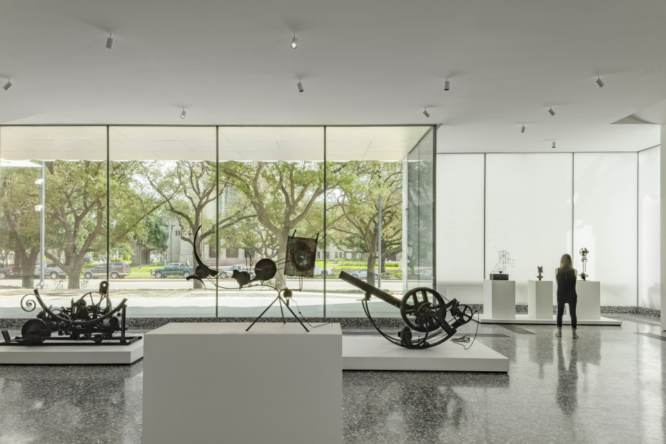
Returning above ground, one finds themselves in front of the last massive glass window, which gives a view of one of the museum galleries. This gallery displays kinetic artwork from the likes of Jean Tinguely and others. The works are mostly a dark brownish color, and Tinguely’s works, which were donated by Dominique de Menil, the famed art collector who founded the Menil Collection, are front and center, Tinguely worked in the Industrial Age, and, along with other Dadaists, created sculptures that poked fun at the ugliness of industrial goods. One of his most famous works, once displayed at the MoMA, destroyed itself, leaving only a few pieces. Tinguely often worked with recycled industrial materials, and this is on full view with these junk metal sculptures that could easily have been thrown away by those who couldn’t appreciate their ridiculousness.
With that, one rounds the corner, and ends the tour of new additions. The new building of the MFAH continues the long tradition of innovation in architecture, doubling the museum’s size and allowing for the display of works that had been in storage for a long time. The building itself is definitely more complicated than what it appears to be, and is definitely more than meets the eye. The experiences that can be had in the expanded sculpture garden and the new Kinder building are so much more than what could be put on pen and paper, so it is absolutely necessary for art lovers to visit the museum in person. All in all, the changes to the museum are a massive success and exceed the expectations of everyone. Steven Holl has created a masterpiece that is sure to be an icon of Houston.
Your donation will support the student journalists of Carnegie Vanguard High School. Your contribution will allow us to cover our annual website hosting costs and fund field trips, competition fees, and equipment. We appreciate your support!

I love reading, learning, drawing cartoons, watching films, and discussing art, history, politics, and business. I also collect historical artifacts,...




Nicole Rodil Suarez • Dec 17, 2020 at 10:46 am
You did an incredible job of explaining and describing the place, it truly was enjoyable to read.
Jonathon Morales • Dec 17, 2020 at 10:43 am
Great writing, this exhibit seems really interesting
Lexy Silva • Dec 17, 2020 at 10:42 am
I like the continuous comparison of the design of building and aspects of artwork to the history of it
Andres Pargas • Dec 17, 2020 at 10:41 am
I like how besides this story being descriptive about the museum it also tells about its history
Julian Namerow • Dec 17, 2020 at 10:39 am
I loved the amount pictures you used so we could see all the structures and building and I also liked when you called all the buildings a “family of buildings”
Vivian Huynh • Dec 17, 2020 at 10:36 am
I thoroughly enjoyed your article and I thought that it really captured the serenity of the exhibit.
Kallisti Clemons • Dec 17, 2020 at 10:24 am
I like how you took the time to describe different aspects of the museum, it sounded beautiful and made me feel immersed.